GUI making: Heads-up Display

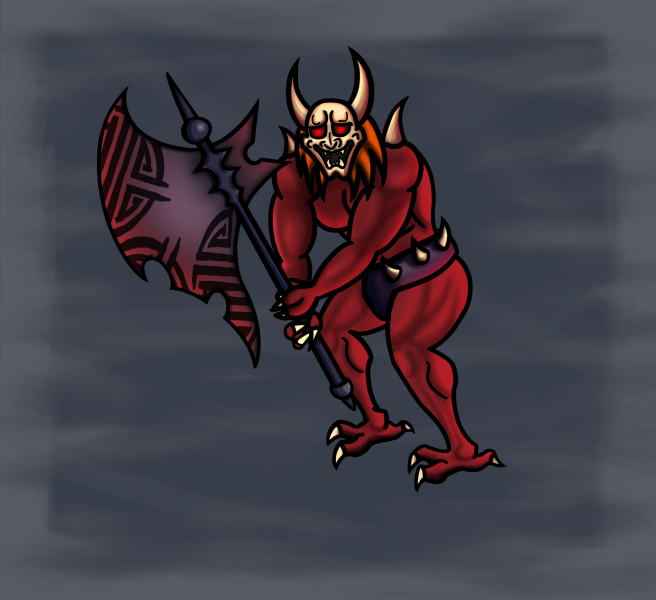
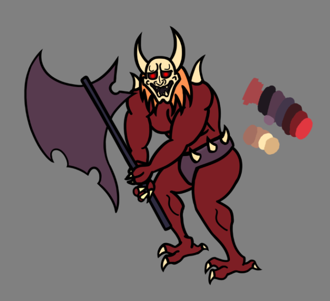
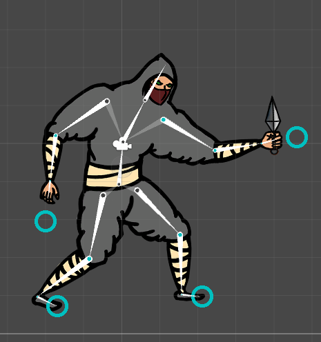
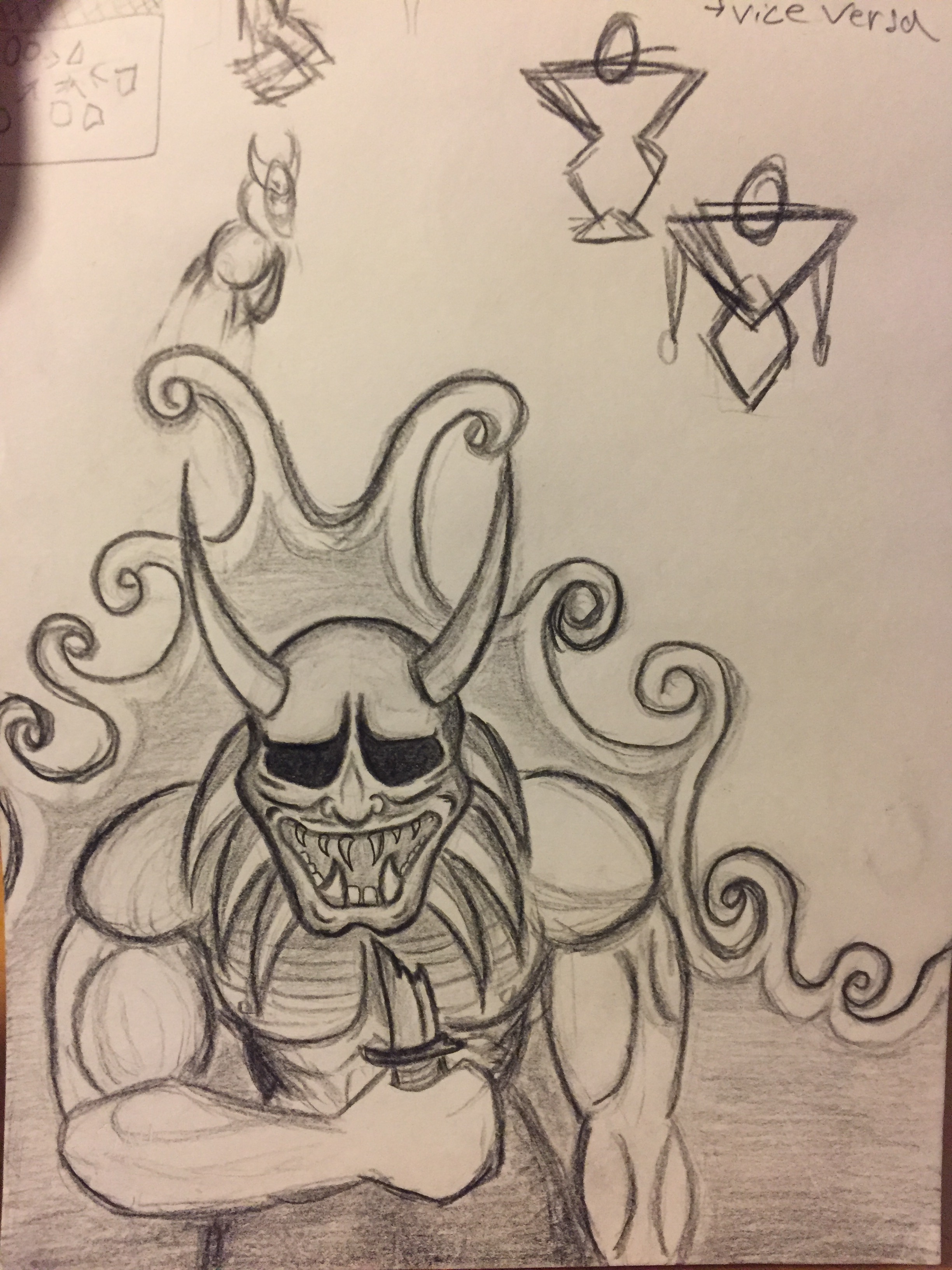
This week we had an assignment on designing GUI in our graphics course. The assignment could be conveniently integrated with our game design project. I shared the assignment with our teams other graphic artist Alexander Linde. My work focused on the heads-up display. Generally I knew that my time was already stretched thin this week since there was still other work left for the game. This was for example animating the demon which would also require some time afterwards to implement.

I planned first to make a health bar, a frame for a power-up icon and -timer and a frame for the score counter. I did not at first have a clear view about all the needed assets, but we had a meeting coming on the next day so I knew we could unify and clear our views on the HUD.

I started by sketching out a mock-up of the basic layout of the HUD on a piece of paper. Then I proceeded to create a digital mock-up which explained the function of the assets better.

HUD MOCKUP

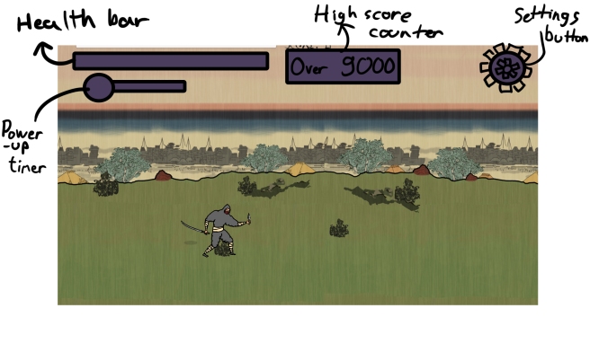
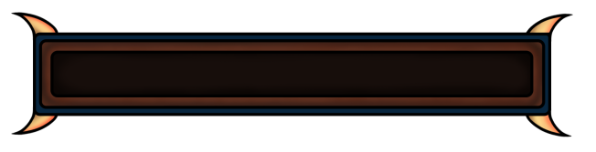
The health bar is the most detailed asset on the HUD. I thought that it should have some character and fit the game’s aesthetic to give the HUD some juice. I chose a classic rectangular shape for it since our health pool in-game was already of that shape, and it would make the implementation faster. I cut making a custom health pool out and trust the coders to fill it with green for the health pool, since time is of the essence. Once again the horns were a simple tasty thing to add complexity to it. After an initial try with one horn I decided to add them on every corner.

I chose blue and brown for the colours on the frame after experimenting with some other colours on a picture of the gameplay. Brown fit well into the game’s nature rich atmosphere, but the deep blue was a riskier choice. There was still something so calm and comfortable in the combination of brown and blue. I couldn’t find a better combination and it sit comfortably on the screenshot of the gameplay.

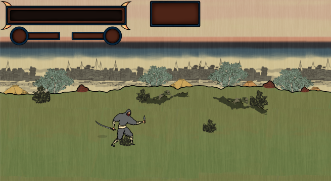
Down below a picture of the health bar and under it a composition of the assets in the game’s environment.

Until next week!

Whole_HP_Bar

Final_Compostition

Rendering the Demon

This week I have solely focused on rendering the Demon enemy to look more bad ass. The process of coloring and rendering have been definitely the most enjoyable parts of creating the whole of the design.

I would say I have definitely succeeded in the “more bad ass” -part but as I worked on the image I noticed my lack of experience in painting texture and lighting. As you can see there is no specific texture on the character, other than the “smooth” look that the shadowing gives. Still, considering the purpose of the character I came to the conclusion that it is good enough. A high level of detail wouldn’t be very visible on the in-game sprite anyway.

First what I did was refine the look of the weapon. I knew I needed some edgy detail to make it look more like a demonic axe. I started with adding some mass and spiky forms to the handle part. It needed some sort of objects in each end of the handle to comfortably end the handle bar part. Also in the previous version the part of the handle in the middle of the axe’s blade looked quite unnatural so I literally decided to draw random spiky arches on that part to get some mass on the area.

For the blade I added a red glow to the edge of the blade for a more ominous vibe. I also re-used art for the markings on the blade, that I had previously made for an invincibility power-up. I thought they looked cool on the blade so I decided to keep them. It also saved me time from designing new scribbles and runes for the blade, though I might still do it if I find time for it.

The lighting is done in a general all-around lighting and by that I mean there is no specific direction for the incoming light sources except for one, which is the red glow on the characters body and horns. This light is projected from behind the character.

Down below I added pictures of the old version and the rendered version for the ease of comparison. I am generally quite happy with the result. I think I have captured a visual of a dangerous demon enemy well, but I do see many things here I want to improve on. One for example is the texture and lighting of the body parts.

That’s all for this weeks short post. See you next week!

demonmelee_rendered

meleedemon

Continuation on drawing a Demon enemy

Time for our game project is running short as we only have three weeks left to implement remaining graphics and polish the gameplay. We have realized that we were very ambitious with our game from the start. This caused a lot of stress in the start of the project, it even rendered me unable to produce much for some periods. This week, however, I’ve had immensely more creative energy. It has resulted in clearly increased productivity. I am seriously hyped.

This weeks highest priority has been creating the digital version of the melee-type demon enemy. This week I got my first digital sketch of the demon done. It finally got the wheels rolling for concretely producing the sprite. Before, I felt like I was stuck on making infinite iterations of the demon on paper.

meleedemon

Most of the time so far I have spent on making the linework. I made the lines quite thick since the character will be reduced in size on screen in the game. This will make all fine detail and lines thinner and harder to notice. I stuck to very basic muscular forms for the body, which adds to the “bulky melee character”-aesthetic. However the basic forms did not look very demonic or evil. This is why I added some spikes to emphasize on it. In the start of the design process I recall thinking about adding a bulky waist armour for the demon, but this had been long forgotten until today when my group member brought up the idea of a loin cloth. The waist armour was also a great chance to add some more demonic and evil forms, which in this case was spikes once again. I still plan on adding some detail for example on the weapon and waist armor, but I’ll save that for after I’ve implemented an initial sprite in the game. It’s important to see how it affects the aesthetic of the game and how it fits its functional purposes.

Since the character will be animated, all the body parts have to be animation friendly. In practice this means that when a body part moves and reveals more area, it has to have appropriate graphics under it. This layered way of drawing the body is very new to me, consequently increasing time spent drawing.

For the base colours I chose somewhat a classic hellish look; bloody red for the skin and bony yellow for the spikes. As for the armour and the axe I wanted something colder and desaturated to contradict the warmth of the skin. The purple colour is still quite warm but I’m planning to make it colder with shadowing and also add a gradient colour shift from a dark blueish-purple to a bright red towards the edge of the axe.

Im very happy about the progress I’ve made so far and just generally hyped about the upcoming colouring, shadowing, detailing and rendering. But I have to keep in mind the Japanese woodblock style art, which tends to keep the shadowing very flat.

That’s all for this weeks post. Thank you for reading and have a good one!


Anima2D and Animating in Unity

This week has certainly been interesting and challenging. My whole focus has been in first of all learning an animating tool in Unity called Anima2D and secondly making the animations. Everything I’ve done this week I have no previous experience of, so I would say that half of the work hours have been learning how to use the software and how to apply it on my work.

Anima2D basically allows the user to set up a bone structure and a mesh map for the sprites. The bone structure will connect all the parts of the character and make them move realistically in conjunction with the other bones. The mesh mapping for the sprites will allow the mapped textures to blend along with the bone movement, making the whole animated movement more realistic and smooth.

Here you can see the bone structure of the character. The blue circles aka IK’s are points that move all the bones that are connected to it. You can see the joints in the bones have turned blue from the parts that the IK affects. As you might notice, not all the bones of the limbs are connected to the IK. This is for better control of the limbs. The IK’s will not affect any body part that is not connected.

bone_structure

One big time consumer has been finding out how all the different sprites for the body parts must look for them be able to look natural in multiple positions. For example the body has to have some sort of shoulder/back area drawn for when the arm and shoulder part in front moves away, exposing the back area. I made mistakes on the first try and that cost me a lot of time since I could not just replace the sprites but had to map the new ones again for Anima2D, I actually repeated this process three times and I am still not quite satisfied with the outcome.

With the animation rig I created for our game’s main character, who is the ninja I previously presented, I created walking and idle animation cycles for it. Animating with Unity was a challenge since you do not have the same creative freedom to change anything in the sprites unlike with frame to frame animation. I had to specifically plan out how I would use the sprites so I would know what kind of visual requirements they would need to meet in different animations and poses.

Unfortunately I haven’t found an efficient way to show the animations in the blog. That I will fix for the next blog post, until then!

Designing a Japanese folklore demon enemy

Last week I started designing a melee type demon enemy for our game. The enemy spawns to a demon realm in a 1800’s Japanese setting where the old clashes with modern. The design process was quite interesting since our graphical style tries to mimic the Japanese woodblock print which is a very flat 2d drawing style. I’ve yet to learn that style yet but here’s how the demon design process went.

I started out by researching old Japanese folklore demons and quickly noticed that the classic Oni mask was a commonly used representation of a Japanese demon. I decided to use that as the face for the demon and proceeded to learn how to draw it and at the same time tried to pick up some definitive characteristics from the mask so I could later on simplify the linework and detail while still keeping the aesthetic of an Oni mask.

Here is my inital try on the Oni mask:

IMG_1546.JPG

At the same time a more general idea of the enemy had been forming in my head. The idea was that the enemy would be this huge brute with a slouching troll-like body and posture, who would smash his enemies with slow but powerful attacks. This was because of the fact that he was a melee character. I continued by designing his body shape, which I made an upside down pyramid to make him look powerful. After that I made a sketch of the demon from the front view to clarify the aesthetic to myself better. I also added some spiky hair coming out under his mask to add to the demonic and animalistic look.

Here is the front view sketch and some body shapes:image1.JPG

As I drew the bigger picture of the demon I more concretely stumbled upon the design of the weapon which I had not thought about much. So I initially thought that it could be a broken katana which would fit the Japanese aesthetic, but then I began thinking that it should be a more strength portraying weapon like a hammer, club or a big axe. I ended up on a two-handed sword type of a weapon because of it’s smooth looks and it plays well into the game’s theme.

Finally my greatest problem was how to portray all this sideways because I am not very experienced on drawing side views. So after some practicing I ended up with the version I will show below, but first I want to note that he has an extra hand on his side which I drew for the purpose of experimenting on multiple pairs of limbs but I deemed it unnecessarily complicated to implement as well as unnecessary for the aesthetic.

The next step will be to implement the design digitally.
image2.JPG